CAJU Design System
How we built from scratch the design system of Brazil's largest fresh-produce retailer — unifying scattered digital products, eliminating inconsistencies, and laying the foundation for a 100% digital culture.
- Role
- Product Designer I
- Team
- Product & Engineering
- Timeline
- 24 weeks
- Company
- HNT (Americanas S.A)
- R$148K+
- Of business value added after integration for the quarter
- R$592K+
- Of business value added after integration for the year
- 40%
- Reduction in handoff time after adoption of the system
- 4
- Products covered with tokens and themes from a single base
Strong in stores. Scattered online.
Hortifruti Natural da Terra is Brazil's largest fresh-produce retailer. With more than 1 million monthly customers and 6,500 employees, the brand has a consolidated physical presence — well-organized stores, careful visual communication, a clear brand identity.
The problem was digital. In 2022, Hortifruti kicked off a strategic push toward a 100% digital culture. When we looked at the existing product ecosystem, what we found was a series of disconnected experiences.
Apps, sites, and internal tools that looked like they belonged to different companies — each with its own palette, typography, component patterns, and navigation logic. Design and dev teams working in silos, duplicating effort every sprint.
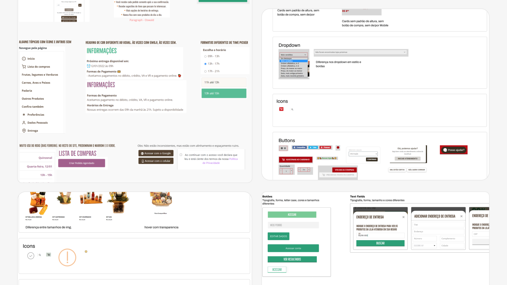
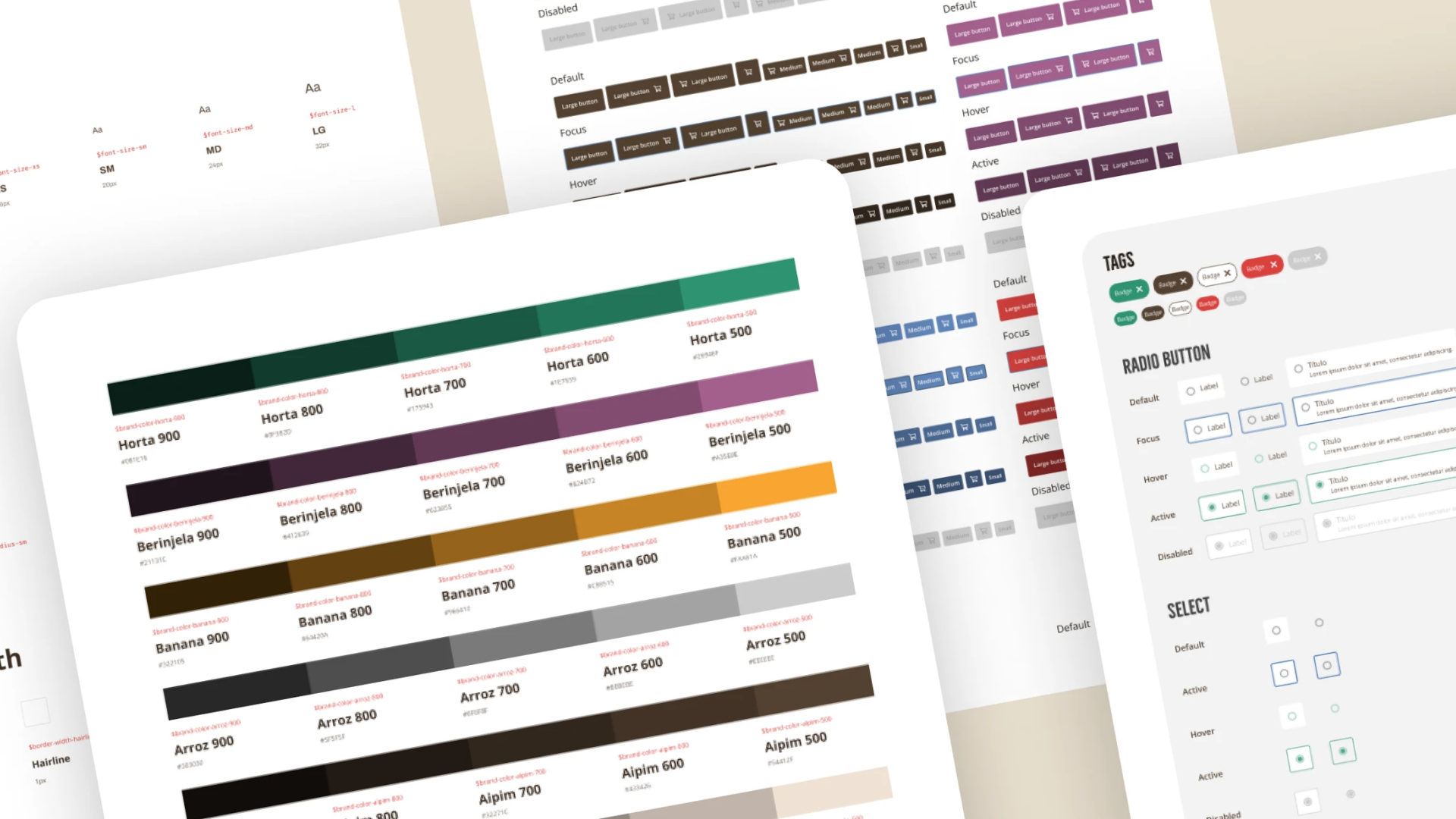
200+ inconsistencies and no source of truth.
Before defining any solution, we mapped the current state of the digital products. The diagnosis was more serious than expected.
Users who didn't recognize the apps as Hortifruti's
Developers reporting frequent rework
Products with visual inconsistencies between themselves and the brand
Each designer ran an independent sweep across the products, documenting everything off-pattern. In total, we mapped more than 200 inconsistencies — incorrect file types, logo usage outside of the brand manual, duplicated components with arbitrary variations, different typographic scales per product, conflicting navigation patterns, and documented usability flaws.
It wasn't a problem of visual perfectionism. It was a product governance problem — the absence of a shared source of truth made every team reinvent the wheel each sprint.
Fragmented identity
Digital products didn't visually communicate that they belonged to the same brand. Customers who knew the physical stores didn't recognize the apps.
Chronic rework
With no shared components, each team specced and built the same elements from scratch. Styleguides and handoff burned weeks per project.
Untrustworthy experience
The 'Bebidas Express' app was called out directly: dated visuals and confusing usability made users distrust the product itself.
The field doesn't lie.
Research wasn't done with data alone — we went in person to one of Hortifruti's stores to interview and run usability tests with real users. The contrast between the physical and digital environments was revealing on its own.
Methodology
- Field research: in-store interviews and usability tests
- 7 semi-structured interviews with end users
- Working sessions with product, design, and engineering stakeholders
- Collaborative product sweep with inconsistency mapping
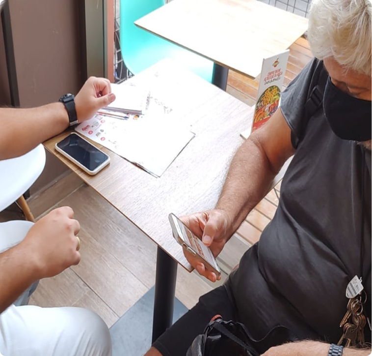
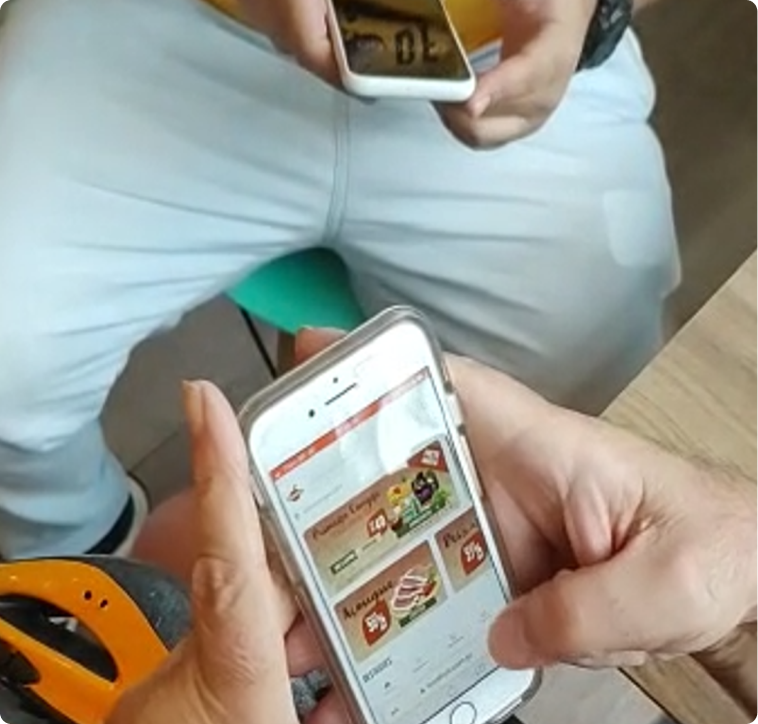
Field research at a Hortifruti store — interviews, usability tests, and brand artifacts in context.
“I find it odd that the stores have such a beautiful, organized interior and the website feels kind of messy.”
“Bebidas Express looks outdated, it doesn't feel trustworthy. I'd rather come in person.”
“We spend a lot of time making styleguides and screen specs for every project.”
The physical store was the benchmark. Users used the in-store experience as the reference for judging the digital one. Digital lost that comparison by a wide margin.
Trust is tied to visual consistency. Users who didn't recognize the brand in digital products distrusted the product itself. Visual inconsistency isn't just aesthetic — it's a conversion risk.
The invisible cost of rework. No dev or designer could quantify exactly how much time was lost — and that was exactly the problem. With no system, the cost normalizes into routine.
Three questions guided the system.
With field data in hand, we ran a structured working session with the team. We used an effort × impact matrix and a SWOT analysis to prioritize directions and move into brainstorming.
How might we create a single visual language that works across multiple products without locking down each one's room to innovate?
How might we reduce handoff and spec time without creating a dependency on a specific person or tool?
How might we make Hortifruti's physical brand feel as recognized in digital channels as it is in stores?
The principle that guided everything
The most important decision was to choose a modular architecture — not a closed, prescriptive system, but a set of foundations that allow experimentation. Universal base components, product-specific libraries, and tokens that can be overridden per theme. The system grows with the ecosystem instead of being rewritten.
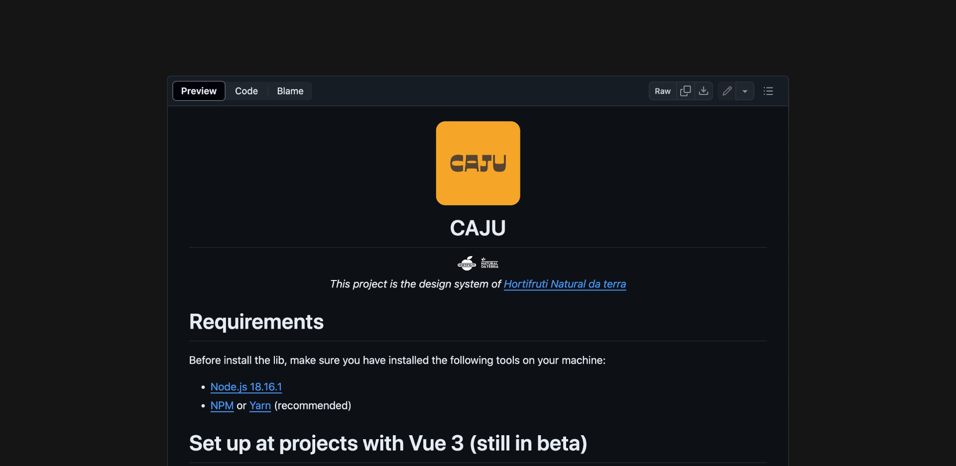
CAJU: a name, an attitude, an architecture.
Beyond being a 100% Brazilian fruit, the name is an acronym that captures Hortifruti Natural da Terra's unique way of being:

| Letter | Meaning |
|---|---|
| C | Claro |
| A | Amigável |
| J | Jeito |
| U | Único |
Layered architecture
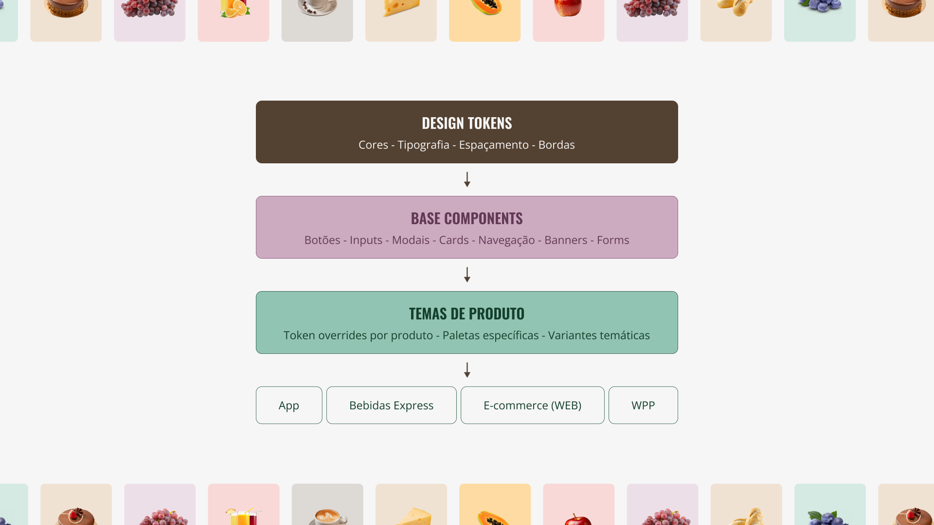
| Layer | What lives here |
|---|---|
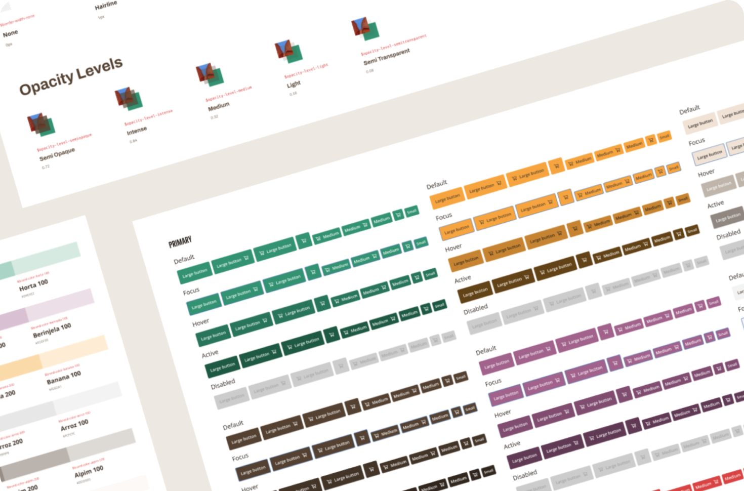
| Design tokens | Color, typography, spacing, borders, icons. |
| Base components | Buttons, inputs, cards, modals, navigation, etc. |
| Product themes | Token overrides per product · product-specific palettes. |
| Products | Hortifruti App · Bebidas Express · E-commerce · WPP. |
Design decisions
Tokens first, components later
The temptation is to start with the visible components. We started with tokens — color, spacing, and typography variables. That meant any product could have its own identity by overriding tokens, without recreating components.
Two library types: base and product
Base components are universal and reusable. Product components are specific and live in their own libraries. This split avoided the bloated-design-system trap where nobody adopts because it tries to solve everything.
Brand manual as anchor, not bible
CAJU was built on top of the existing brand manual — but it wasn't a literal transcription. The manual was the starting point; real product needs shaped the final palette, type scale, and component patterns.
Documentation as product, not appendix
Documentation in Figma and Zeroheight wasn't delivered at the end as an instruction manual. It was built alongside the system — every component documented at the moment it was created.
Before and after CAJU.
- 200+ visual inconsistencies across products — no owner, no systemic fix
- Styleguides and specs created from scratch every project, burning weeks
- 69% of users didn't recognize the digital products as Hortifruti's
- No source of truth: each team made design decisions in isolation
- One palette, one type scale, one component library — for every product
- 40% reduction in handoff time
- 4 products covered with tokens and themes from a single base
- Detailed documentation in Figma and Zeroheight — adopted end to end
“The Hortifruti Natural da Terra product team loved the final delivery — from the choice of name to the detailed documentation.”
What this project leaves behind.
Being new to it is a competitive edge
This was my first design system. At the time it felt like a disadvantage. In practice it meant unbiased opinions, questions nobody else was asking, and solutions not anchored to old habits.
A design system is a product, not a deliverable
The temptation is to treat it as a project with a start, middle, and end. The modular architecture was a deliberate choice so the system would grow with the ecosystem instead of going stale six months after launch.
Tokens first, components later
Starting with the most abstract layer paid the biggest dividends. Any product can have its own identity by overriding tokens without touching component code. That cut adoption friction from weeks to days.
The field doesn't lie
Running interviews in-store surfaced the most important insight: the user distrust of digital was real, measurable, and benchmarked directly against the physical experience. Qualitative data in the right context beats any dashboard metric.